
Music CD Cover
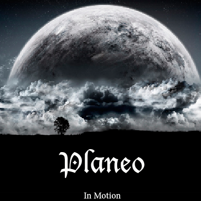
For the CD I tried to make the cover and the back have the same theme. I chose the planets theme because I have never seen it on an album cover before. For the cover I made the very interesting planet design on the top and left the bottom black so there would be room to write the band name in large font. The clouds below the planet really make the cover more enticing. I used the line tool to make a small white line at the bottom of the cover to draw attention to the album title because it is written so much smaller than the band name.
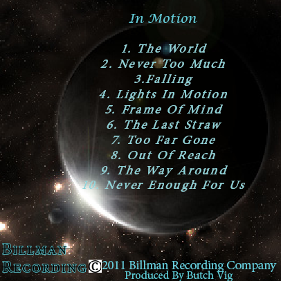
On the backside of the album I made sure that there was a full planet to draw the attention of viewers. Since the planet is such an important focal point of the back cover, I made the track list appear in bright blue font on top of the planet. The blue font really adds to the character of the back cover. I strategically placed the recording company logo and information at the bottom of the page because it doesn’t interfere with the track list. That is also where most people look for that type of information.